Guest authors Camilla Audia and James Porter share their reflections on a learning experiment inspired by our Active Learning Design case study.
Background
Dr James Porter: I am a critical environmental geographer specialising with a particular interest in the science-policy interface, risk management, and social theory such as co-production in the context of climate adaptation, flood risk, and water. My postdoctoral research sought to understand how scientists’ efforts at the UK’s Met Office to model climate change embody a range of considerations, at once socio-technical and institutional-political, about what makes climate information ‘usable’, how it should be used, and by whom, so as to grapple with the real concerns faced by decision-makers. I currently hold a teaching fellowship post in the Department of Geography, King’s College London.
Dr Camilla Audia: I am a postdoctoral researcher and social scientist focused on co-production, climate change, resilience and indigenous knowledge. I have a passion for investigating wicked problems and my work focuses on natural resources especially land management, climate change resilience, indigenous knowledge systems and disaster risk reduction/management in Sub Saharan Africa. I am interested in interdisciplinary research, interactive teaching techniques and active learning for different disciplines. I am currently particularly keen in developing my skills around human-centred design practices for development. I am currently based at King’s College London, with research duties also at University of Sussex, Brighton.
Tableau: What is it? And why use it?

Camilla: Since meeting Elizabeth Hauke, I have been following the Live Love Learn blog. I found the idea of using techniques for teaching out of the classroom really appealing and I had wanted to try this group activity since I read about the “Active learning design” case study on the blog.
In spring 2019, I was part of the teaching team for the “Environmental Science and Policy” Masters’ module, offered to students in the Department of Geography at King’s College London. Midway through the term, we held a brainstorming session with James Porter, the course leader. Whilst the teaching sessions – consisting of an hour’s lecture followed directly by an hour’s seminar – worked well, there was a concern that students needed to challenged more. We needed to shake things up. But how?
I had read about the Change Makers ‘live tableau’ educational initiative at Imperial College, where students have to think creatively, quickly, and decisively on how to represent real-world problems such as clean water and sanitation, hunger, poverty and gender equality, using only their minds, bodies, and of course whatever is easily accessible around them. For instance, visualising marine pollution could involve a student playing dead with a plastic bag coming out of their mouth. So, I pitched the idea of a live tableau and James was on board.
The next question was, unsurprisingly, how are we going to do this?!
James: I needed to think about how the module’s learning objectives would be met as well as the logistics involved. 35 students were enrolled on the module, split across 3 seminar groups, and all coming from very different academic and cultural backgrounds. I decided to run the live tableau in the final session so that students had a good working knowledge of the module’s key concepts, debates, and ideas, and this would also, importantly, give me time to organise materials, book rooms, and prepare properly.
Camilla: The teaching team really liked the idea of getting students to use their minds, bodies and the outdoor spaces to picture the module’s concepts. However, there were several concerns. Would the module’s concepts/theories lend themselves to visual representation? Would student attendance be too low as other module deadlines compete for their attention? And would the weather be on our side?
How do we align the tableau and the learning outcomes?

James: A week before holding the session, Camilla and I met up for an hour to discuss how to run the tableau. We agreed that the learning aims could be met: from critically interrogating environmental problems from different political, social and historical perspectives; development of teamwork skills in preparing and presenting research; to refining oral/written communication skills via the use of visuals; if the event was well structured.
To that end, Imperial’s blog explaining how they prepared, and ran, their tableau was crucial. Over the week, I repeatedly returned to the blog for inspiration.
The key now was to: (i) review the module’s concepts – agree on which concepts/theories we wanted students to focus on and which ones might prove too complex and should be excluded; (ii) agree on a structure for the session – what are the different activities, how long is needed to complete each one, and what order they should be run; and (iii) identify any materials needed – something to write on, and to write with, camera for taking photos, rooms, and instruction packs.
Camilla: After agreeing on nine broad concepts that cut across the module we focused on logistics. How many groups do we need? And how many students should be in each group? Allowing students to self-organise was an option but we had to dismiss it. Forming new groupings, potential imbalances in group sizes, and students simply joining up with their friends, would take time away from the activity as well as the emphasis on working as a team. As the class was already divided into 3 seminar groups, we decided to break these groups into 2 smaller ones to give us 6 groups in total of 5/6 students – if all the students showed up.
We then moved to discuss what materials were needed. This helped us think through how the module concepts could be made into tableaux. For instance, if students wanted to represent problems about how research is funded, for whom, and to do what, they could use monopoly money, ‘guess who’ cards, or something else. We liked the idea of getting students to think about how different items could take on new meanings. We brainstormed the pros and cons of different items including Lego, tarot cards, scarfs, marbles, matches, dice, coins, cans, and other board games. The ready-to-make “kits”, with printed instructions, raised questions about how we distribute these materials quickly, fairly, and without stifling creativity. In the end, we decided on a material’s table where students could come and choose the items they wanted to use (if they wanted to use anything) with a maximum of 3 per group.
James: Having agreed on the materials, we then needed to understand what we could practically do in a 2-hour session. On closer inspection, we quickly realised that we had 1.5 hours, not 2. Time is lost at the beginning and end of each class due to changeover time of the lecture room. Moreover, the final session of the module needs to bring the different analytical threads together, so time was needed to do this. With the remaining time, we need to explain the activity, split students into new groupings, distribute the kits, get the students to agree on a concept to tackle, create a poster, perform a tableau using a GIF, return to the classroom and present their work, and then vote on a winner. This was going to be a challenge!
Camilla: Despite having identified all these different, yet interrelated, working parts, there were still several questions for us to answer: (i) What role should we (teaching staff) play in the activity? Do we offer help? If so, how much?; (ii) Is it a problem if all the groups pick the same concept? Do we need to allocate concepts to groups? If so, how do we do this?; (iii) What do we do if attendance is low? Revise the session? Scrap it?; and (iv) Do we tell students in advance about the tableau?
We decided that our role, as teaching staff, should be limited to explaining the instructions, keeping students on track/time, asking them questions, and solving any technical problems. We also agreed not to tell students about the activity in advance to avoid them coming with set ideas about what they wanted to do. Points (ii) and (iii) would need more thought.
What preparation is needed to make the tableau work?

James: Three days before the activity went live, I started to prepare the slides, kits, and rooms but there was a problem. I had to do all of this from hospital with a poor internet connection. I decided to break the work into things that required the internet (e.g. room bookings, GIF instructions) and things that did not (e.g. module concepts, slides). I focused on the latter. The next day, when home, I could do the rest.
The first problem I encountered was how to get students to pick a module concept to explore. Over the duration of the module, numerous concepts had been covered with some appearing frequently and others less so; some concepts were intuitive and others were more complex; and some concepts spoke to both sides of the environmental science and policy module and others only one side. Giving students a list of concepts that they could choose from would not work as they may need to go back to the lecture slides or search the internet to refresh themselves. Collating the concepts was key but how?
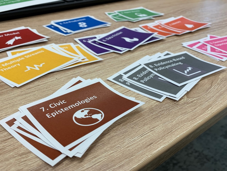
After a few missteps, I decided to create an icon and coloured-coded description for each concept. The icon should broadly capture the essence of the concept. For instance, the linear model of science to policy could be a unidirectional arrow. More importantly, the description for each concept would include one or two sentences on the following: (i) shorthand – science as objective, value-free, truth; (ii) standpoint – science exists separate from society and discovers objective value-free (truths) about reality; (iii) outlook: wider society has little or no role to play in technical debates; and (iv) examples – IPCC, Manhattan Project, Lectures 1, 2. Reading these descriptions, students can quickly understand the concept, see how it’s been applied, and where to look for more information.
A printout of all nine concepts, and descriptions, would be included in the kits given to students as well as uploaded to the moodle platform if students wished to download an electronic version. Yet this identified a second problem: What happens if all 6 groups pick the same concept? This would not be disastrous as each group, I hoped, would interpret the concept differently but it might make a rather dull conclusion to the activity. In response, I allocated the concepts so that each group only had four to pick from, with minimal overlap. To do this, the concept icons were individually cut out and the four assigned concepts put into the kits.
Camilla: A major concern for James and I was the extent to which students would be able, or willing, to turn the module’s concepts into a live tableau. Whereas the Sustainable Development Goals used by Imperial, had very clear normative standpoints such as the need for zero hunger, the concepts in the module provided frameworks through which to understand or problematise initiatives such as clean and affordable energy (e.g. civic epistemologies). Would students be able to create a tableau for these concepts?
James: Two days until the activity, panic set in. I ran through what steps students needed to complete, the order, timings, and where the steps should be completed (e.g. indoors/outdoors). Time was a concern. If students were to present their tableaux at the end of the class, they needed to have finished their poster, taken a photograph of it, performed the tableau and again taken a photograph of it, turned these photographs into a GIF – moving image – and bring that electronic file back to the lecture hall so that everyone can see it on the overhead slideshow. The simplest approach would have been for the students to bring the photographs back to the lecture hall and the teaching team could turn them into GIFs, and then, we could upload them to the slideshow. This would take too much time, however.
After some thought, I hit upon the idea of getting students to create the GIF themselves and upload it to a live, shared, slideshow file already playing in the lecture hall. Creating the shared file was relatively straightforward. It just required changing the access permission of the file and storing it on a cloud -based platform. Creating the GIF-making instructions were trickier. I needed to find an online website that let people make GIFs for free, without registration, which was simple to use. Eventually I found a suitable website the only problem being the set transfer rate between the two images needed to be adjusted so that the image did not make you feel seasick to look at. After some trial-and-error I found a transfer rate that worked, wrote out step-by-step instructions on how to create a GIF, including a link to the shared slideshow file, which would go into the kits.
Camilla: The day before, James emailed the teaching team (George, Roxana and me) with – what on reflection was an overly complex – overview of how the activity would work, what everyone’s role was, and the timings involved. At this stage I was a little nervous about how well everything would come together.
James: One day to go. Another problem raised its head. Whereas Imperial’s tableau session was held at the end of the day, our final session was scheduled in the busiest part of the teaching day. Sending students to work in the hallways would not be fair to them or the classes around them. The only solution was to book extra rooms within walking distance of the lecture hall. I could only book four rooms, and there would be six groups. Thankfully the lecture hall was big enough for two groups to share. However, the room bookings introduced another problem. The rooms were only available for 30mins. In hindsight this was a blessing as it ensured that the students quickly brainstormed ideas for their poster and then headed-out to perform their tableau.
The final tasks involved providing the slides explaining how the tableaux would work, and why we were doing it; preparing the kits for each group; and finding suitable prizes for the winning group and a method for counting the votes. In all the kits contained: 3 coloured pens, 1 A0 sized piece of poster paper, 4 concept icons, 1 colour-coded guide to the meaning of the concepts, 1 coin, GIF instructions, and a pack of starburst (vegetarian friendly). In terms of prize-giving and voting, I opted for a mix of vegan and non-vegan treaties and turned to polleverywhere to host the voting. Unlike earlier in the semester, this time I remembered to limit the voting to one per person!
How did the day unfold?

Camilla: First, the teaching team met up half an hour before the activity to discuss how the session would unfold, what each person would need to do, and answer any queries. Some concerns were raised about how students would cope with the more challenging concepts, but it was decided that this would offer a great learning opportunity as we would gain new insights into what they did or did not understand.
Second, London’s weather cooperated. The sun was shining. This made us hopeful that students would go outside and make use of different spaces! Lastly, attendance was very high, and with only a couple of students missing.
After James gave a brief wrap-up lecture for the module, we asked students to stand up and move to sit with their seminar groups before explaining the activity. I saw some eye rolling as the activity was explained, but I also could see students becoming more excited and a competitive mentality emerge as the contents of the kits were explained. Over the duration of the module a lot of time had been spent exploring how decisions are taken and the challenges faced by decision-makers, which meant the coin toss was particularly appreciated by students, as were the Starburst.
I saw some students go from looking a little lost to looking very excited after they looked inside their kits and saw that concepts had been spelled out for them to choose from.
James: Explaining the activity, I emphasised why we were doing it and what we hoped to achieve. I highlighted examples from Imperial so that students could get a feel for what was expected and how they might approach the activity. I reiterated how the photographs must be taken: landscape; provided a map showing them where they could go within a 10min walking distance of the lecture hall; and laid out the structure for completing the activity and the prizes for the winning group.
Camilla: I definitely saw some relief in the students when James showed a slide of his own tableau, saying that “he would never ask them to do something he wouldn’t do himself”. To my surprise, the table of materials did not attract students at first, despite including not only an Italian version of the Monopoly game but also Lego pieces and dice, which I thought would be a hit. Each seminar leader then went through the steps of the activity and the timings, which looked like:
12.30pm–13.00pm: Nominate a leader, photographer, researcher and note-takers for the group. We thought this help quieter students to play a role and provide a more inclusive setting. Use a coin toss to break deadlocks, choose a concept, pick materials, brainstorm and produce a poster. Take a picture of the poster.
13.00pm-13.20pm: Pick a space to perform the tableau outside of the lecture hall/booked rooms. This was designed to encourage students to explore different spaces, using the map provided of nearby locations for inspiration. Use the materials collected and anything else they deemed necessary to produce their tableau, and take a photograph of it.
13.20pm–13.30pm: Follow the instructions on how to produce a GIF and upload it onto the shared slideshow.
13.30pm–14.00pm: Each group presents their poster and the rationale behind their tableau; votes are cast via PollEverywhere; and prizes given out!
And off the students went with their kits to create their tableaux.


What worked well?
Camilla: It came as a pleasant surprise that the timings worked well. Going around the groups I saw lots of discussion and brainstorming around drawings and scene set-up as well as some research, looking back to lecture slides and readings. As the activity was conducted in the last session, and the next summative assessment looming, students quickly realised that they could use the class to revise their understanding of the module’s core ideas, conduct some research, and receive feedback.
The group size was also a very positive point, as was the idea of keeping it within the seminar groups. While this could have been an opportunity for more collaboration between students, I could see that they were at ease interacting with each other as they had been having informal discussions in the seminars for the whole term.
James: Another learning objective was to support communication skills and teamwork; from what I could see without wanting to interfere in the discussion, a clear leader in some groups world ask questions to the others and listen as well. On reflection, I think the activity helped students to be more critical and visual in their thinking. One student remarked that having to think about making the concepts visual helped them to realise that the theoretical core of the module was very much linked to practice and everyday life.
What could we have improved?
Camilla: While everybody managed to complete the activity, more time was needed for questions after every team presented their rationale. Throughout the module students had shown that they particularly enjoyed asking questions or giving peer feedback, so building in more time for this is key.
How students used the materials proved fascinating. Most teams used the Dixit or tarot cards. The cards were random images which they linked to their concept. I think this was brilliant and it made their job easier. If I were to run this again, I would probably try to put some of the materials in the kit and ask to use one or two of them, to have them engage more creatively with 3D objects. I am still perplexed why nobody used the Legos. Perhaps including a list of the materials in the instructions would be helpful.
We also discussed the possibility of assigning topics to the groups or asking students to pick a concept out of a hat rather than having them choose. Two teams did focus on the same topic and there’s a fear that groups would only go with concepts they best understood or enjoyed whereas assigning a topic could encourage them to engage more fully with the more demanding parts of the module.
James: In terms of tech, the GIFs and shared document procedure had some hiccups. While students made the GIFs fairly quickly they had a difficult time uploading them into the shared PowerPoint file. There was also a problem with one group that had used different cameras to take the photographs of the poster and their performance. As a result, the GIF would not work due to the different ratio aspects.
While displaying the GIFs during the presentation on the overhead screen, the lecture desktop would not allow us to loop the images, which meant we had to manually correct for this as the images jumped about. Although this was not crippling, it was annoying. An alternative would be to dispense with the GIF. Have the posters laid out on the floor and put all the tableau photographs onto a single slide on the overhead screen.
One team also had a hard time with the live tableau concept itself, and I think we could have made it more explicit that they needed to include themselves in some form – actually miming a concept. Lastly, we should have asked the class to guess what concepts each tableau represented before the groups explained them.
The final posters and tableaux
